How to build
a movement,
not a campaign.
A community-led movement system co-designed with communities across Barking & Dagenham. Creating stronger local engagement, trust and ownership around reducing inactivity.
The brief looked like a rebrand and website. The work looked like a movement system. Co-designing alongside schools, residents, providers and youth groups in Barking & Dagenham, making the thing in the rooms where it would have to land.
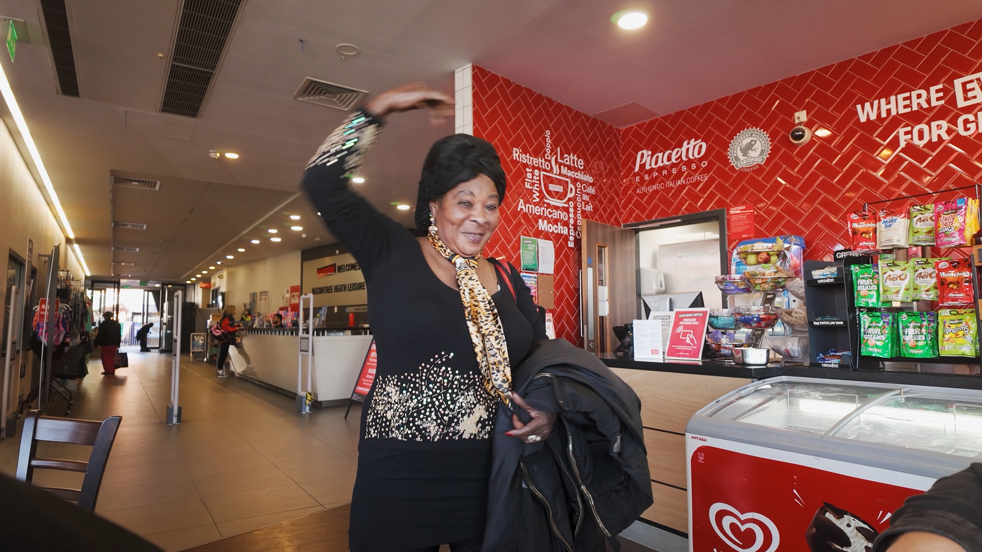
Like many places, Barking & Dagenham already have activities, organisations, venues and people doing brilliant work. The challenge isn’t about a lack of effort or passion. It's about fragmentation. From the outside, the landscape felt noisy and difficult to navigate. Different initiatives, different messages, different audiences , often all competing for attention. And for people already disconnected from physical activity, the sector language and visual identity of sport can unintentionally create distance rather than connection. There was a clear opportunity to create something more joined-up, more human and more locally owned. Not another campaign layered on top, but a shared identity communities could actually recognise themselves in.
The borough already had energy, it just needed a shared way to express it.
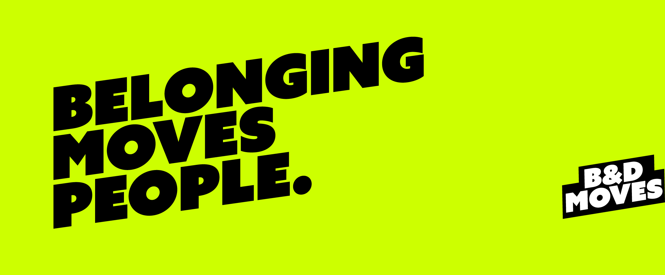
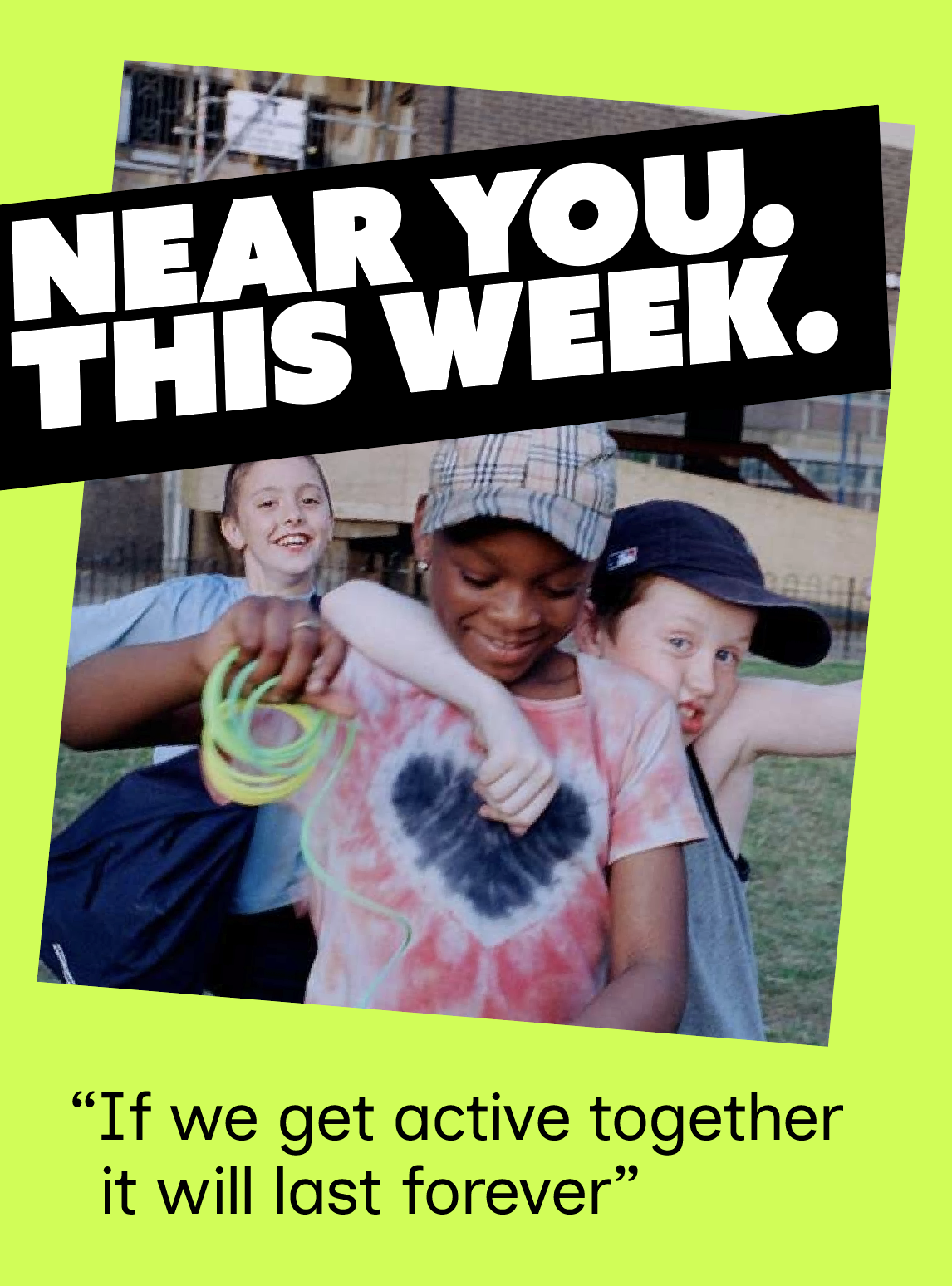
Most place campaigns talk to the already-active. We worked the other end of the funnel. Lowering the bar, taking the pressure off, making movement feel local and social. Belonging moves people.
Most place brands
- Market activity
- Centralised brand
- Polished comms
- Aimed at the active
- Programme > person
B&D Moves
- Design for inactivity
- Locally adopted
- Honest, low pressure
- Aimed at the stuck
- Belonging > programme
From activity
→ reducing inactivity.
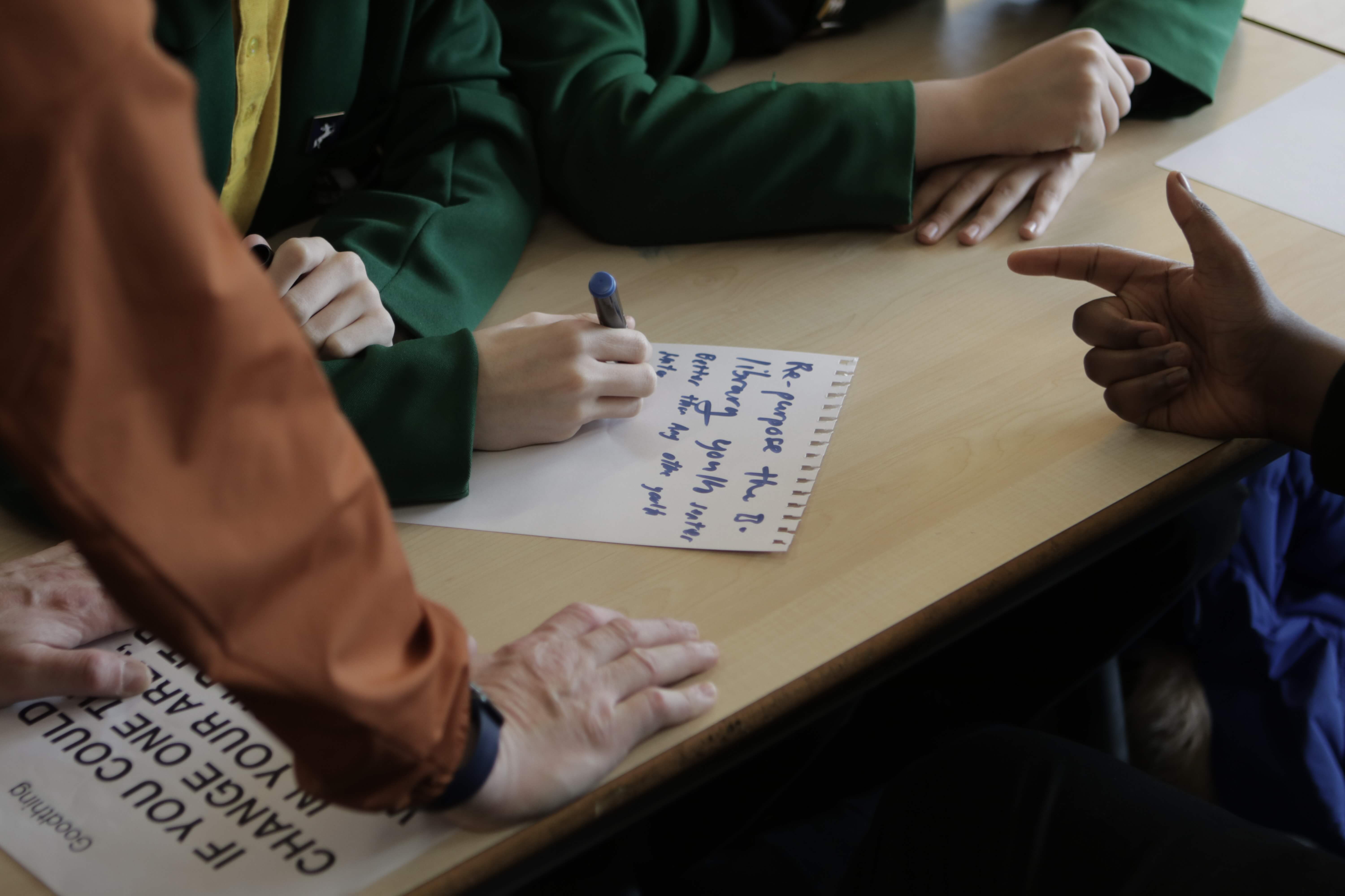
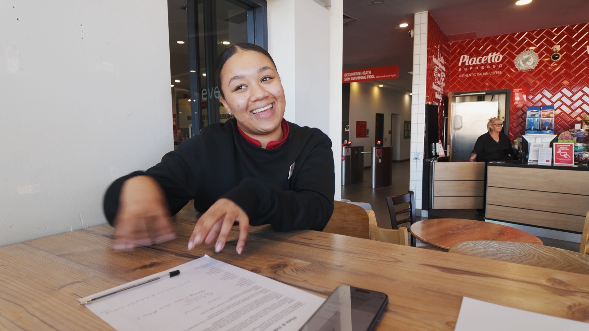
School workshops, resident interviews, sessions with health, faith and youth leads. Co-design wasn't a phase. It was the medium. If they didn't feel ownership of it, we changed it.
"You were able to encourage and adjust the way in which you could get all of our various disabled participants involved which is a rare ability."
Alongside.
Not at.
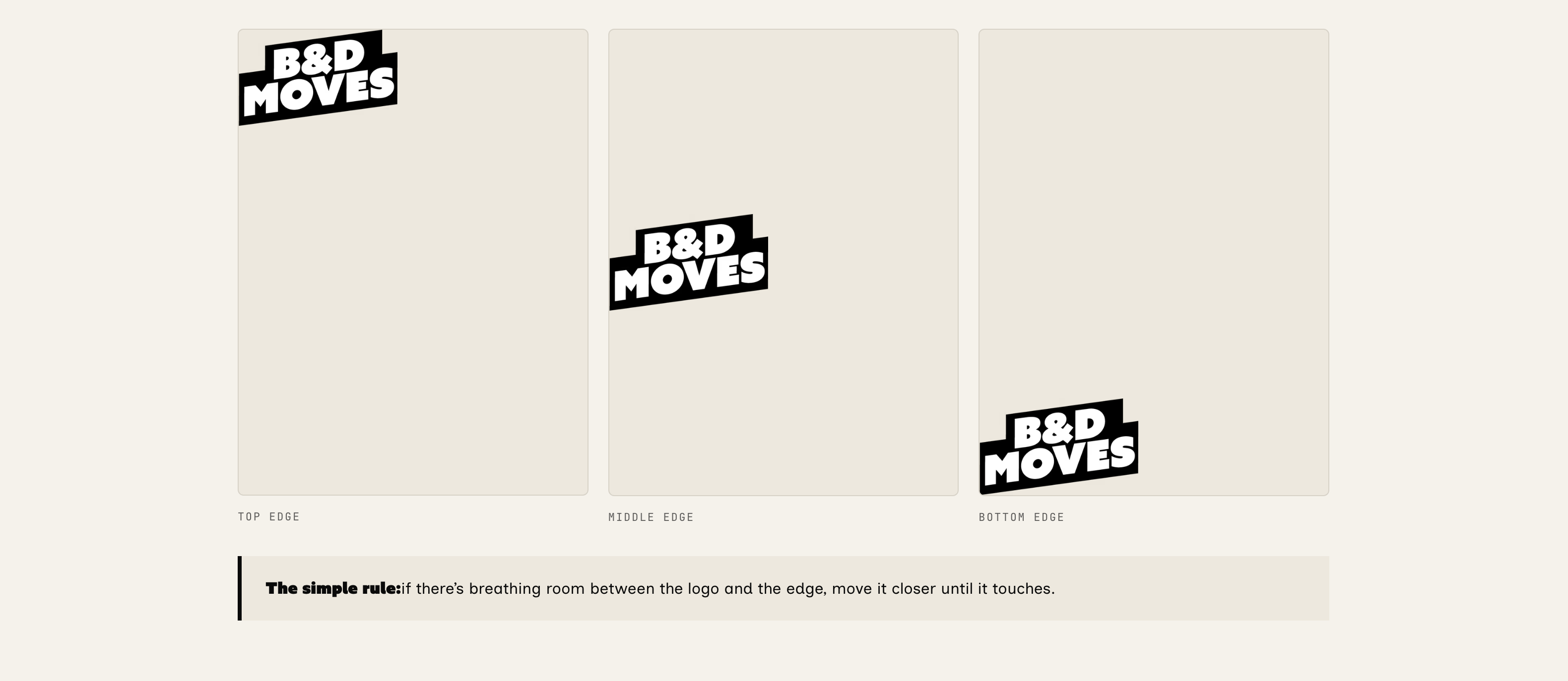
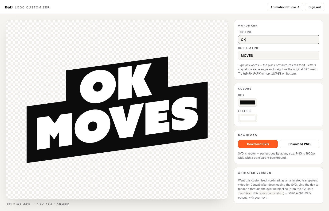
Nine working components, each independently usable, each co-owned by partners. The mark is the thinnest layer.
The success metric isn't whether people like the logo. It is whether the people and partners use it.
The logo style is the only thing that's fixed, everything else is built to flex.
Type is the loudest voice in this system. We picked two fonts that do opposite work. One to stop you. One to look after you.
123!?Azo Super · Black
Azo Super, for attention.
The shouty one. Tight tracking, near-black weight, a slight forward lean. Used for headlines, posters, anything that has to land at three metres in bad light. It stops you.
Inclusive Sans, for everyone else.
The name does the work. Open letterforms, generous counters, a humanist tone designed for accessibility-first reading. Body text. Long-form. The voice you stay with. It looks after you.
Lime as a flood, not an accent. Ink for impact. Paper for breathing room. Locked-contrast pairs make the system WCAG-accessible out of the box.
Lime
Green
Ink
Black
Paper
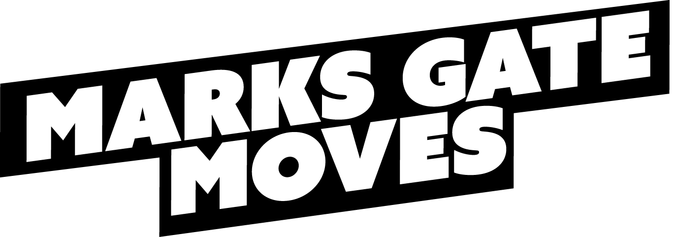
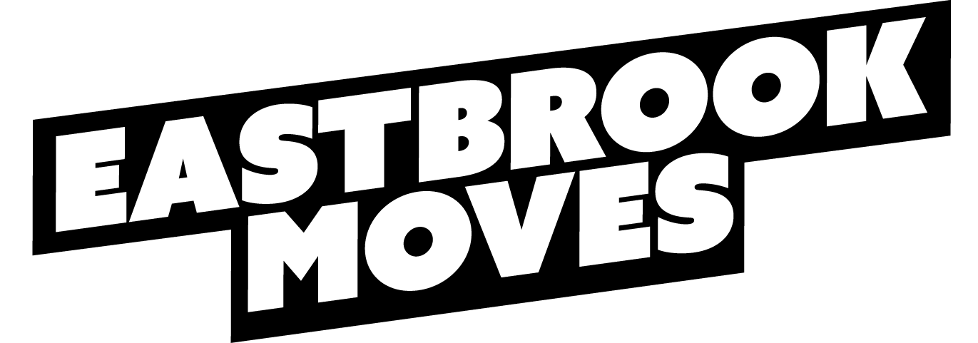
Eastbrook.
Marks Gate.
Becontree.
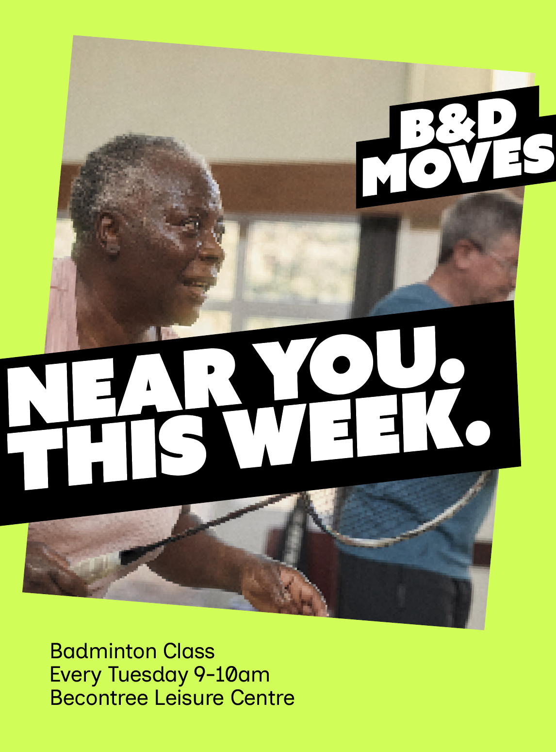
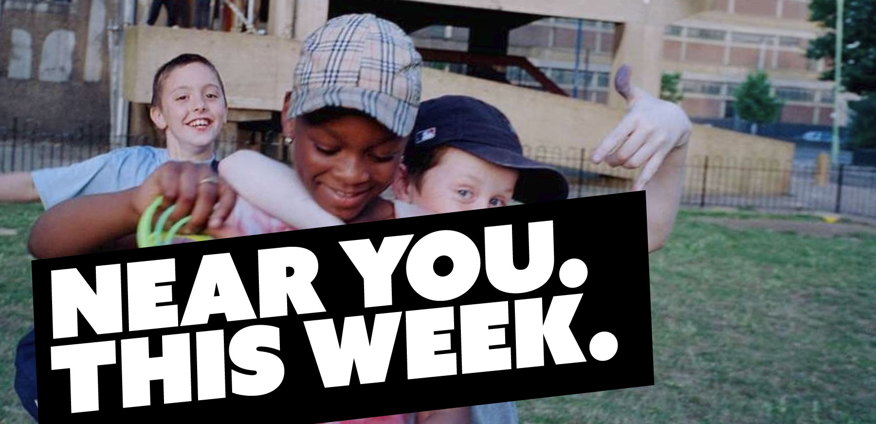
WCAG-accessible by default. Mobile-first. Printable on the cheapest community printer without losing its punch. Most place brands fall apart at the noticeboard. This one was designed there.

Estate
noticeboards
Printed. Built to read at 3 metres with bad light.
School
corridors
Locked logo, swap-in headlines. Co-designed with pupils.
Leisure
centres
Window vinyls and reception A-frames. Same kit, different surface.
WhatsApp
groups
Square graphics built to land in a community chat without explanation.
Not a campaign. Not a leaflet. Talk like you're inviting a mate. The voice was set by pupils, residents and youth workers, not by us.
Local
Place names, mate names, road names. If it's not specific to here, it's not for here.
Simple
One idea per sentence. Read it aloud. If you trip, it's too long.
Honest
No spin. No corporate. We just take the pressure off.
Low pressure
Invitations, not instructions. Doors, not gates.
B&D doesn't feel modern or old fashioned. It feels like now.
The hub is the operating layer. Sign in once, walk out with something you can use that afternoon. We measure adoption, not impressions.
Not impressions or reach. Stakeholder buy-in, partner uses, local variants in the wild, demand for rollout. Movement metrics, not campaign metrics.
What we'd tell an Active Partnership starting from scratch. Or one that's spent two years building a place brand nobody's using.
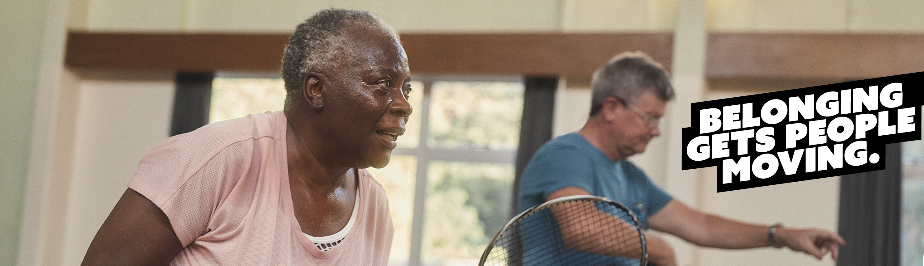
Belonging
moves people.
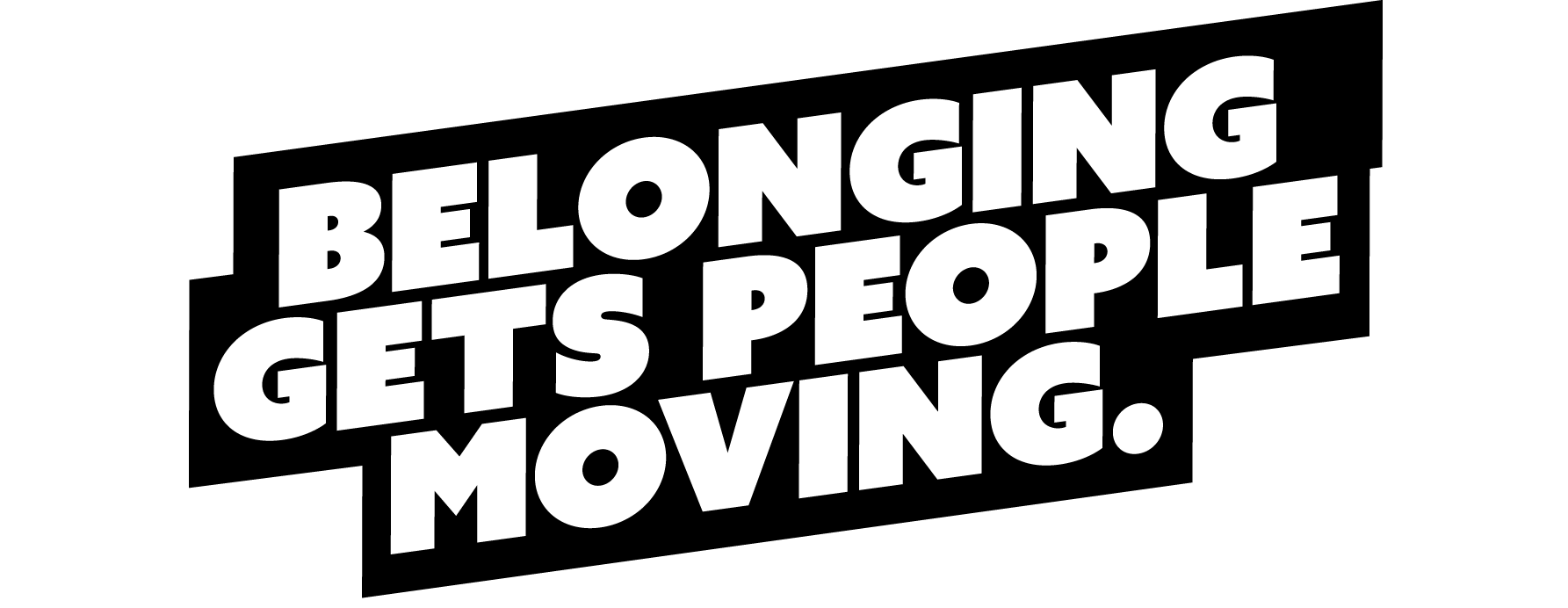
Most place brands fail because they stay centralised. Participation grows when local people own the work. B&D Moves is what happens when you design an AP brand as a movement system: replicable, adaptable, and owned where it lives.
Bring this approach
to your place.
If you’re an Active Partnership, council or place lead trying to move beyond campaign-by-campaign comms and build something communities and partners genuinely use, we’d love to talk. Book a discovery call and we’ll show you how we approached B&D MOVES, what we learned through co-design, and how this model could work in your place.